Back on June 28th, I did a rather loooong post about two books that I checked out of my local library, (
HERE) that I was eagerly devouring, trying to learn more about Victorian Era decor, particularly what types of paint colors, carpeting, wall papers and window treatments would be 'appropriate' for my house.
While I don't intend to create museum-quality rooms (I wish I could, but lack of that little thing called 'money', prevents it!) I do want to make it look "right", to the best of my ability, of course.
I used some of my newfound knowledge to attempt to "read" my house and try to get an idea of how the original owners might have decorated the house and try to decipher what the original woodwork looked like (before it was painted a million times) and verify what things are truly original, and what might have been added at a later date. I used mostly the information in
Victorian Interior Decoration: American Interiors 1830-1900 because it used a large amount of contemporary information from the 'premier' decorators of the time.
All of our research points to a build date of 1886-1887 for our house. Encaustic tiles were becoming very popular for floors, but they were expensive because they were imported. By the 1870s and 1880s, domestic manufactories opened and made them more readily available. Critics of the time period recommended tiles for use on hearths and around chimney openings, in vestibules and bathrooms as floors, and as wainscoting in kitchens, conservatories, laundries and porches.
This is the tiled hearth around the fireplace in the entry hall. Significantly, the colors are a brownish copper, black,taupe and a gold-yellow color, leading me to believe the entry hall's original color scheme was similar. In the 1880s, the recommended, fashionable colors for use in an entry hall were "low yellow colors", with "cherry woodwork" and other colors like olive green, tan, dull purples, Pompeiian red, sunny greens, old gold and dull blues with woodwork in either oak or mahogany shades.
The fireplace mantel has matching tiles around the fireplace opening, including these pretty decorative ones in each corner.
The previous owners painted the entry hall this mustard/gold color, which is actually the 'right' color scheme for this room, although originally the entry hall was probably wallpapered. In the period between 1870-1890, it was then fashionable to have the "tripartite" wall. A tripartite wall consisted of a dado or wainscoting at the bottom of the wall, a cornice or frieze at the top, and a field in between dado and frieze. The most expensive way to achieve a tripartite wall was to use wood paneling for the wainscoting. A cheaper way was to use sets of wallpaper imitating dado, field and frieze, or to use Lincrusta or anaglypta for the dado. Most "principle" rooms in the house would have had a tripartite wall treatment.
![]()
Unfortunately, all the woodwork in our house has been painted; many, many times in some areas. Decorators of the time period from when our house was built recommended staining hardwood trim in some natural color, and to paint softwoods to correspond with the overall color scheme of the room. White paint was declared "objectionable" and by the 1880s it was not fashionable to have white painted woodwork at all, unless the color scheme of the room was predominately white. I have been long trying to determine if the woodwork in the entry hall was stained or painted. Here on our staircase, this newel post finial is showing a layer underneath the white paint. Numerous hands rubbing over this newel post over the years has rubbed off the white paint. Underneath is what appears to be a dark brown paint.
![]()
The woodwork was painted very sloppily and very quickly, apparently. In places like this, underneath the window stool of the little window on the stair landing, you can see that only one coat of white was applied and the brown is showing through.
This is the trim around one of the hall windows. This side actually faces a corner (I have the picture upside down actually), so it's not very visible unless you stick your head in the corner, but you can see how poorly some of the trim was painted. Again, a dark brown paint is visible (and some green from the walls; evidently the front hall was a dark, foresty green before it was painted gold).
We had started to wonder if the woodwork had been painted instead of stained. It was not uncommon in the 1880s for wood trim and doors to be painted. Recommended colors for the time were black, marroon, chocolate-brown,dull India red, bronze-green, orange-green and dark Antwerp blue. Usually, however, hardwoods were not painted.
Some of the woodwork was painted a light green color at one time, I do know that. On some of the hardware that I've stripped of paint I found, under the white paint, light green, beige and dark brown, in that order. I believe the light green was probably done in the 1940s or 1950s, however.
This decorative knob on the vestibule doors allows us to unlock the double doors. When the knob is pushed down, it pushes down a metal rod that is inside the door frame into a locking mechanism into the floor. I had used a little Goof Off here in this picture to see how well it took paint off hardware. I removed only the top layer of white paint, exposing the light green underneath.
Typically, the upstairs of the house would not have had expensive hardwood or parquet floors, especially in the home of middle-class or upper-middle class folk like the original owners of our house were. However, all the windows and doors have lovely trim, not as fancy as the downstairs trim, but still attractive. Like the downstairs, all the trim is painted white; except the door thresholds. They are pretty banged up, but have never been painted. I believe they are original to the house and are probably the original color too. Here is one of them leading to a spare bedroom.
![]()
The door threshhold to the linen closet. Also visible is the wide planking used for the floor of the closet. More than likely this was painted. This type of floor was common in closets, passages or halls; it was either painted or covered with oilcloth or ingrain, Venetian or list carpeting. I am doubtful that the upstairs of our house had hardwood floors, even in the bedrooms. Grass matting was still very popular in the 1880s and inexpensive and most often appeared in bedrooms, because it was considered more "hygenic". In one of the bedrooms that we don't use, I removed a section of the cheap carpeting previous owners put in, just to see what was underneath and the same wide board planking as in the linen closet (above) was underneath the padding, so I am fairly certain under all the carpeting upstairs is the same thing.
![]()
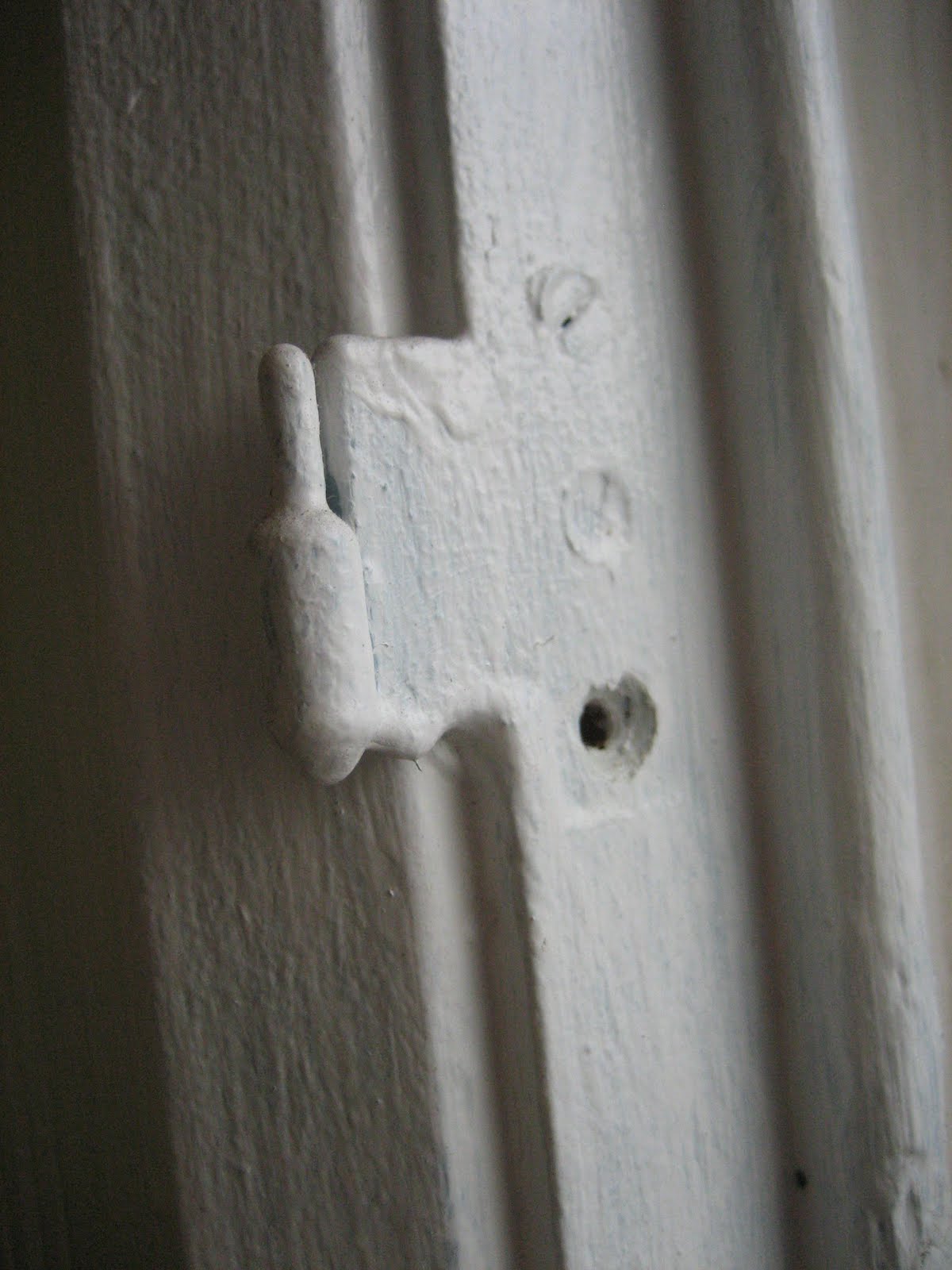
Another reason I don't think the woodwork was originally painted dark brown is because of this (above). On the inside of the linen closet you can see where they didn't bother to paint over the brown at all with white; yet the decorative metal hinges are completely covered with dark brown paint. I seriously doubt that the builders and painters in 1886 would have painted over the decorative hardware like this.
![]()
The room that we refer to as a the 'parlour', but would have also been called a drawing room or sometimes a sitting room, depending on whether the house had another room whose use was strictly for entertaining or not, there is another decorative tile hearth. This one has a lovely border of mustardy/brown leaf tiles, and also colors in black, greenish-bronze and a dusky red/sangria color. I think there was carpeting over this at one time, as there are marks on the tiles that look like where carpet glue was applied. Even in the 1880s, light colors were most popular for formal drawing rooms, but home owners were encourged to take into account the size of the room and it's aspect when choosing colors. Light colors worked well in rooms that had little natural light; like peach, sea-water green,pale blue, ivory, gray, pale rose, apricot and pale lemon yellows, which also had a "rich effect" in the evenings when rooms were lit with gaslight.
However, other suggestions like metallic bronze or copper with pale-olive wallpaper with an India red frieze or rust and silver on a neutral ground were also popular.
A sunny room with a south facing aspect benefitted from richer colors; peacock-blue carpet, olive-green window shades and bronze-green woodwork could have lemon-yellow or old-gold walls and a frieze with bronze-green and dull peacock blue.
![]()
My color choices in painting the drawing room are close enough to what was deemed appropriate for such a room in the 1880s. Unfortunately, the white woodwork, white cornice and white ceiling, would not be fashionable for that time period. If I use the colors of the tile of the hearth as a clue as to what colors they decorated with when the house was built, it appears likely they used a darker, richer color scheme in this room. The family that built our house was named Nelson. They were, for that time period, probably considered 'middle-aged', as they were in their forties then. They had one adult son, who lived with them even after he was married. He continued to live with them, with his wife and at least one daughter, until the late 1890s. The elder Nelson owned a very successful mercantile business; they were probably considered upper middle class and as was common for that time period and for their station, probably had at least two servants.
![]()
The fireplace mantel in the parlour, with it's marble tile surround, is very pretty, but I don't think it's entirely original, like the other two fireplaces in the house. I believe that parts of it are, but some of the decorative trims and the facing parts were added onto the original back at a later date, I think. I can tell because the quality of the wood is different. Those pieces also have only one layer of white paint, while the older parts clearly have much more paint layers.
The fireplace mantel in the living room (which in the 1880s was likely called a 'sitting room' and would have been used like a family room) is also original to the house, but it has a faux brick surround and hearth that is much more modern. I do know that this was not it's original color, however.
In all the tiny little cracks and crevices and nooks and crannies I can see the original stain, some of it crackled with age. Somebody went through the trouble of stripping this mantel and staining it a lighter color. The lighter color would not have been totally out of place in the 1880s; depending on the color scheme used in the room, a golden-oak stain might work better with some color schemes, although the lighter wood colors would become more popular during the 1890s and during the Craftsman period.
Many of the upstairs windows have several sets of these (of course, all heavily painted over). I had often wondered what they might have been for; interior shutters was my first guess and I am probably correct. Interior shutters with movable louvers, sometimes called "rolling slats", were usually stained or painted to co-ordinate with the color scheme of the room. They were often designed to fold neatly into recesses in the window casing when not in use in some homes.
Thanks for joining me! I hope I might have inspired some of you to try and "read" your old house some time!